Client: Ferndale Food Bank
Ferndale Food Bank has been in operation since 1982 and is driven by the belief that everyone deserves access to quality food that is good for you. In collaboration with local partners and community members, (more fondly referred to as 'neighbors') they feed over 70,000 mouths and distribute nearly 1 million pounds of food per year.
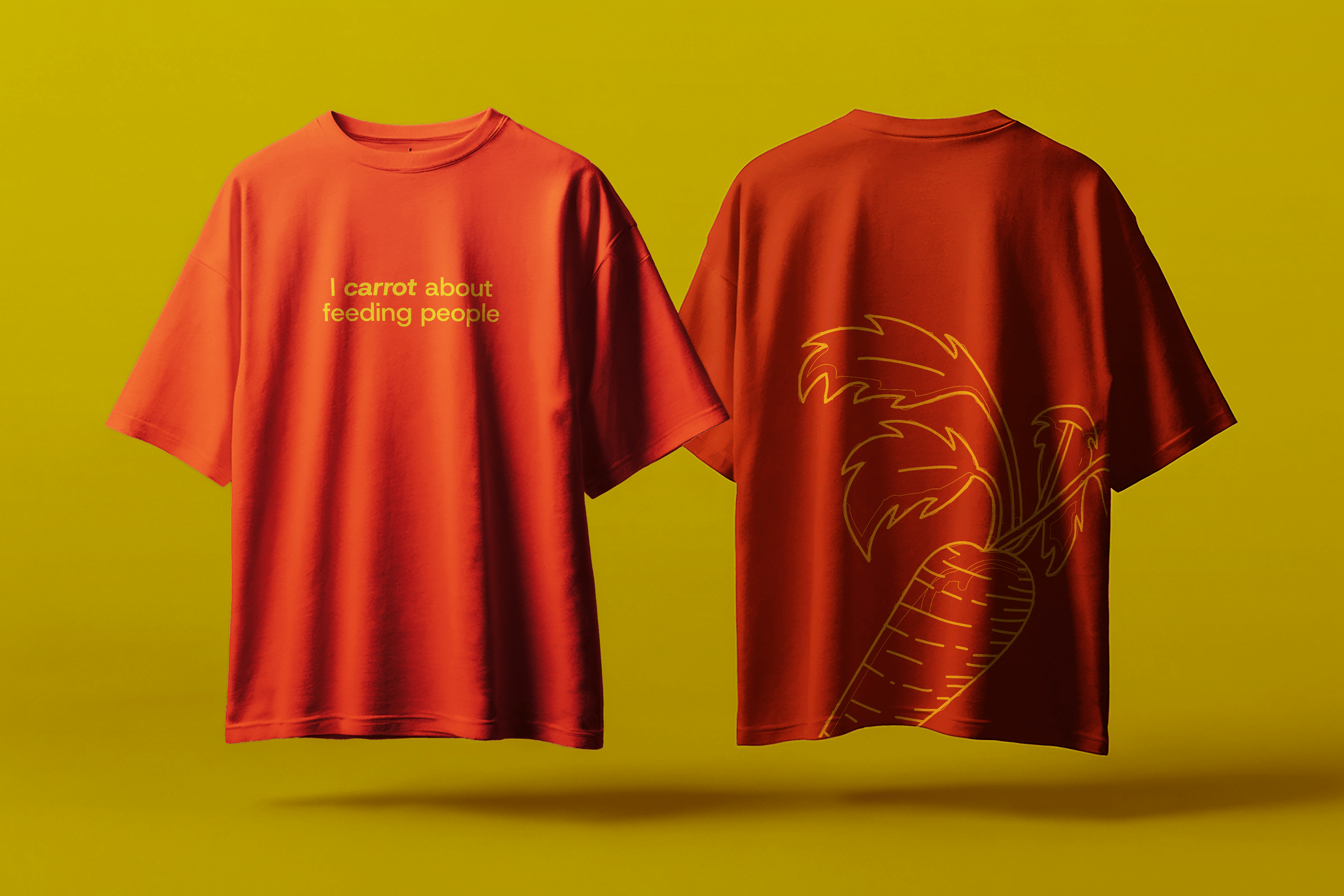
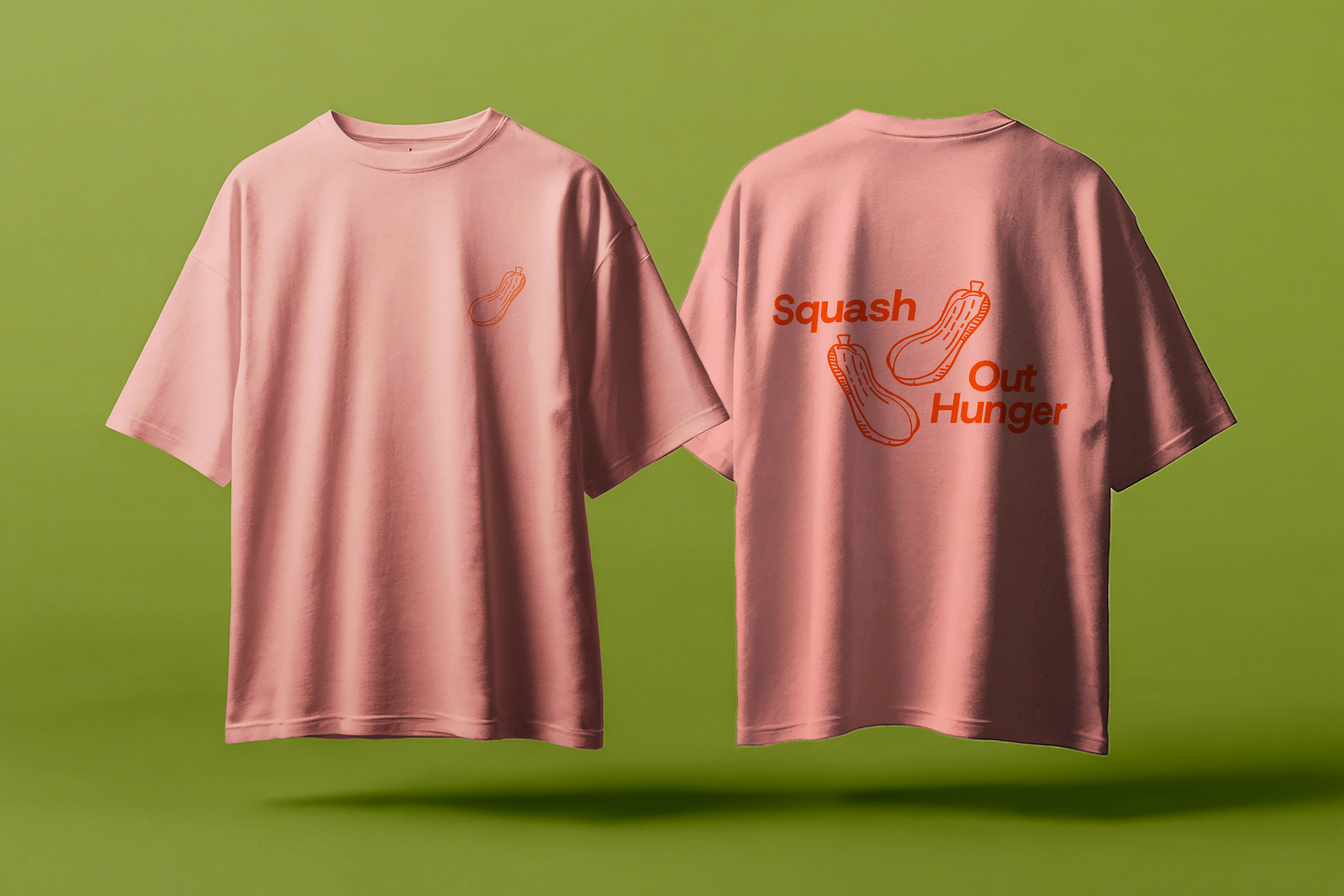
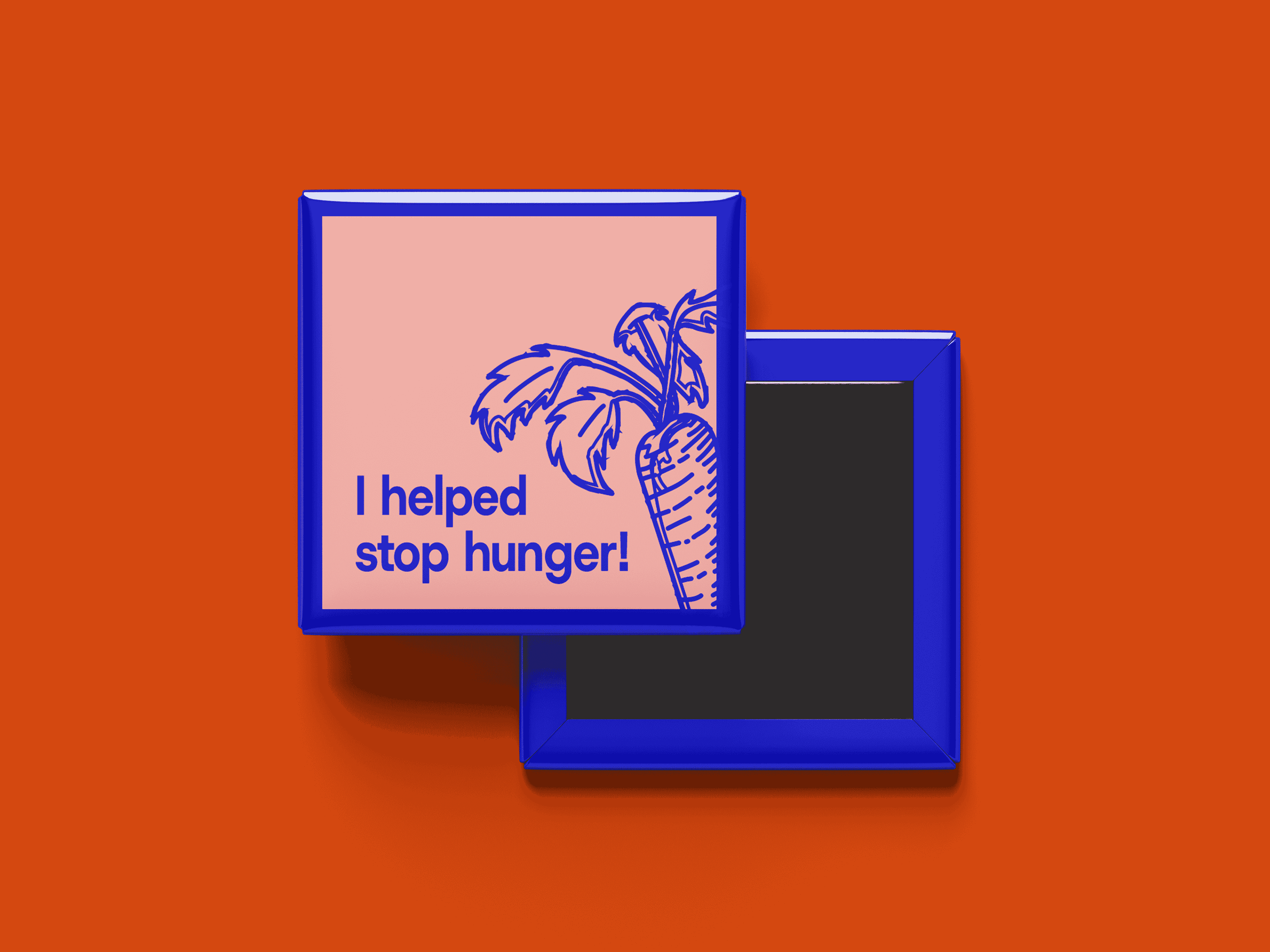
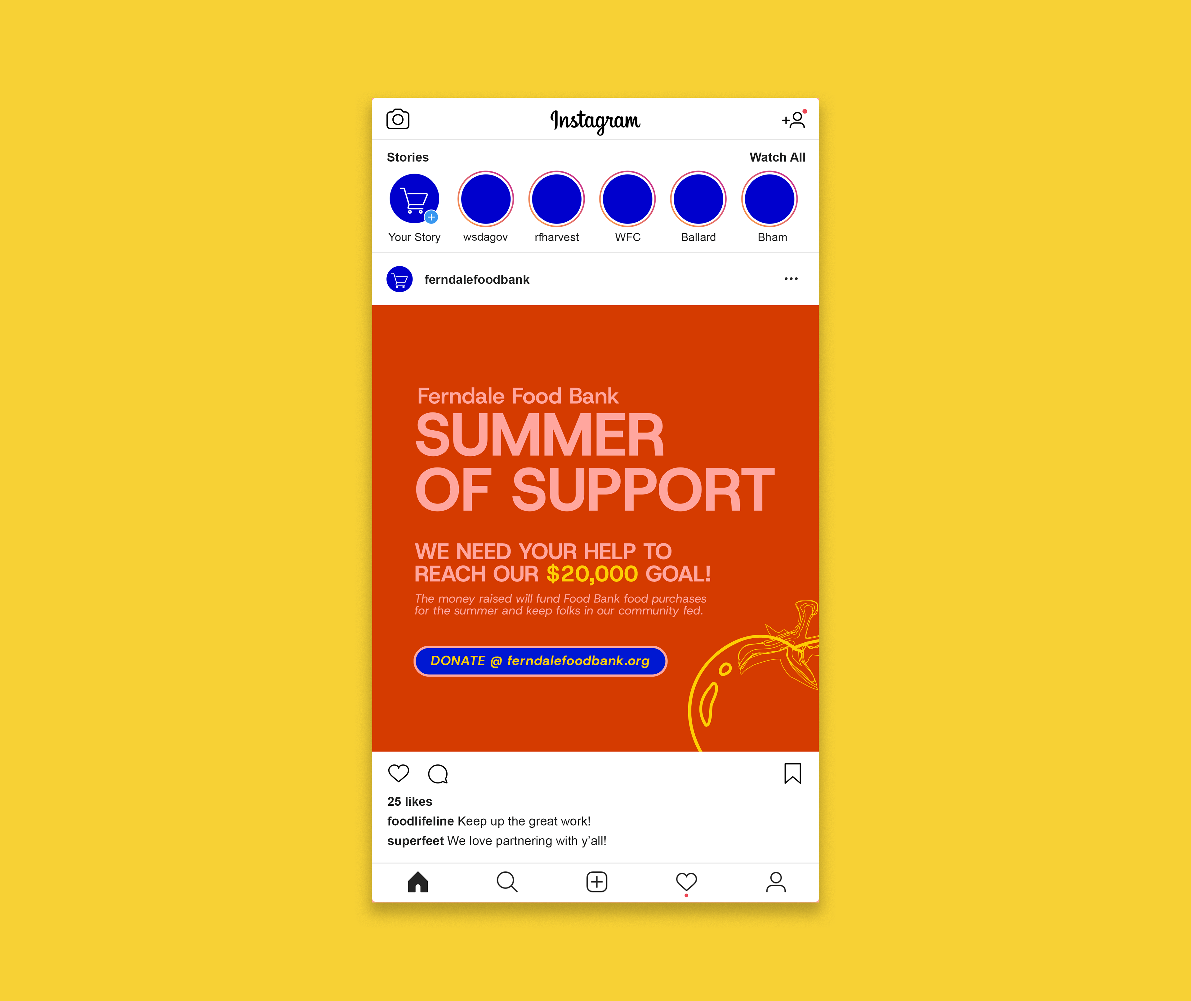
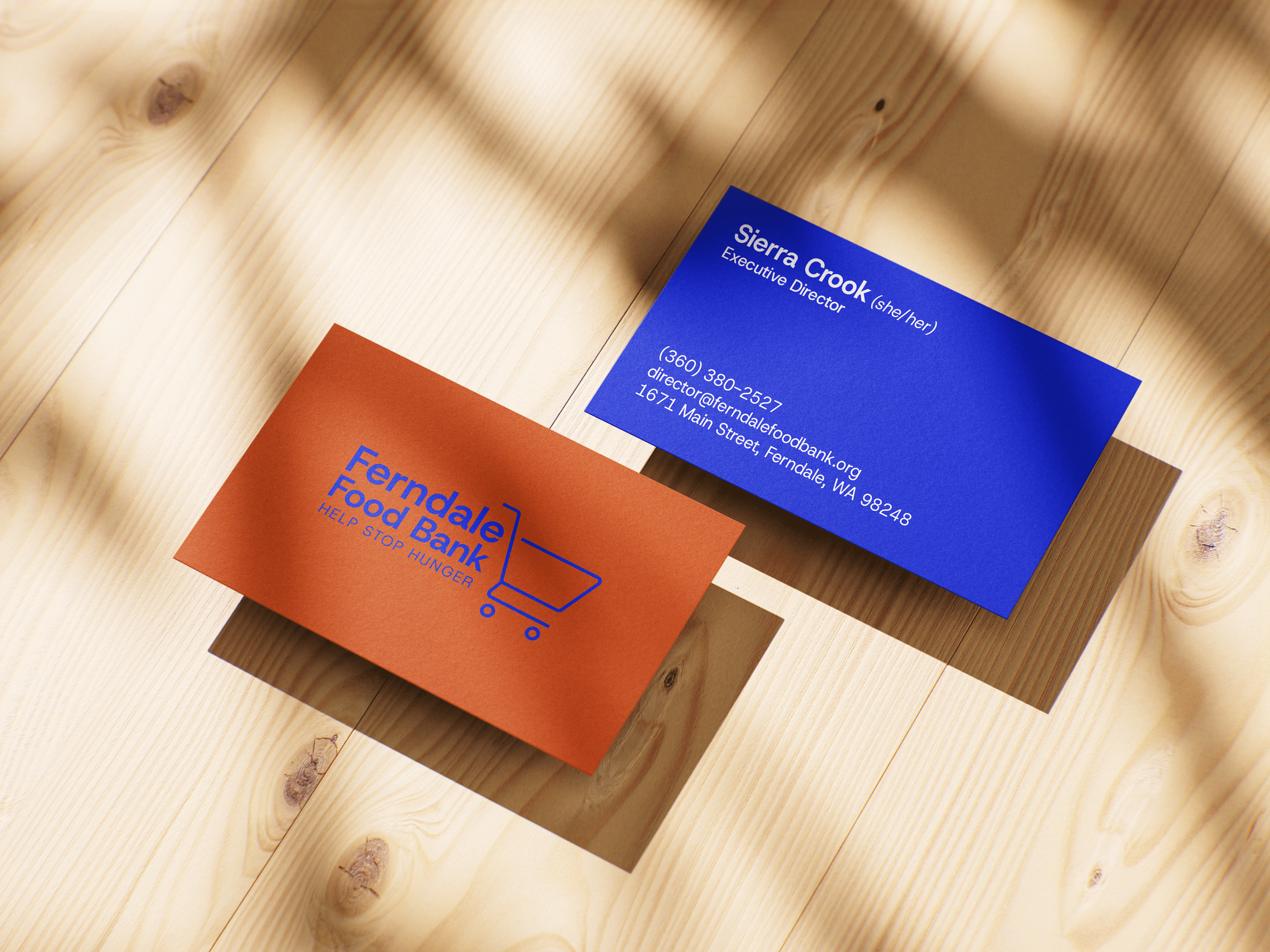
The ultimate goal for the Ferndale Food Bank, along with many others, is to have their client shopping model operate like a standard grocery store. This model helps to restore the humanity of clients, by providing them with an autonomous shopping experience. In alignment with this effort, the Ferndale Food Bank brought me in to give their brand a slight refresh. They asked that I match the ethos of normalizing and destigmatizing the use of food banks, by moving the brand in a more modern direction, while keeping assets like the shopping cart logomark, in order to maintain recognizability in the community.
What came of this is a simple yet personable brand identity that is defined by straight forward and approachable typography, rich friendly colors that one might find in food and/or nature, and assets/deliverables that resemble what you might see from popular stores or brands, out in the wild.